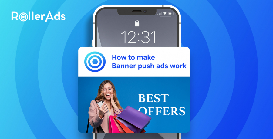
If you want to make your push ads more noticeable, you should understand the basic principles of banner advertising. The right visual content for a banner in your notification can dramatically increase conversion rates and set the tone for your entire advertising campaign. Follow these simple tips, and you’ll be able to avoid most of your competitors’ mistakes.
What is a banner advertisement?
Banner advertising (or display advertising) is an image that appears in a browser on a website and when you click on it, it leads to another site. It is older than in-page push, as well as most other modern formats. This means that its basic principles were formed long before the introduction of the current ad formats.
Of course, formats have evolved: for example, animated banner ads appeared, and with the development of social networks, banners began to mimic these platforms’ visual keys. However, whether you use in-page push notifications or old-fashioned website native banner placement, there are two basic requirements for creatives – images in advertising:
An ad must attract the user’s attention and engagement.
So it must be not only noticed but engage the user to the point of clicking on it and visiting the advertised website. Here the visual of a creative must come to the aid of push ad technology.
How banners fit in with push ads
Most push ad formats consist of two parts: a banner image and a text message.
We tend to think that visual makes it catchy and draw attention, while the text is perceived logically and determines the final decision whether to click or not.
But banner image conveys much more information: its quality, its brand image, even its color code influence the user’s decision as much as what it actually offers in its message. The internet today is visual in the first place, so the main precursor for click is user trust. And it is largely determined by the first visual impression of your advertising.
This means, even with the best research and targeting, if your banners look bleak, sloppy, or sketchy, your campaign is at risk of failing.
How to create a catchy banner ad
As you have understood, the text for such ads is a way to explain what the user saw, and the creative itself is your call to action and the first attempt to make a conversion. So think of the text and description as important but complementary tools, focusing most of your attention on the visual part.
Don’t forget the groundwork
Make sure you know your target audience and their needs. Know what you want from them – is it just a click, a subscription, or a purchase. Formulate campaign goals and funds for it. Research your competitors and see where you can get ahead.
Quality is user trust
It seems obvious, but after looking at enough ads, you’ll notice that many advertisers neglect it. Use high-quality images. Check the text for clarity and errors, and use readable fonts.
Standardization is a show of class
Remember that images have different formats, and banner ads have standard resolutions to which images are cropped or stretched. Also, keep in mind the difference between mobile and desktop devices.
Uniform shapes, color schemes, and locations of brand attributes convey an additional message: you have a system, which means it inspires confidence in the seriousness of your brand. In the long run, you should be recognized by your colors and presentation format alone. Just look at the ads of big brands: you will recognize most of them without hints from name and logo.
Less is more
If you have a standard size banner, it does not mean that this space is must be filled in its entirety. On the contrary, a popular trend in banner advertising is the white space, when most of the ad is free of any text or images. It makes the ad attractive as a bright spot of color and proportionately highlights important content inside the banner itself.
Be direct
Show your product or the desired outcome for your users, focus on generating expectations. Your goal is to make them click, so be direct in your messaging. It’s the same with the text: it should assist the visual, not tell the story. Try to limit it to a few words.
Play on multiple boards
Always prepare at least three creatives for any campaign – the more, the better. That way, you can figure out what works best and which ideas are worth saying goodbye to. A/B testing will help you do this. Remember: the more data you have from a campaign, the more successful the next one will be.
Why banner ads might fall flat
If you follow the guidelines described above, you will greatly reduce the risk that your ad will go unnoticed. But even if you do everything right, other factors can ruin your campaign’s performance.
Banner fatigue
Where there is banner advertising, there is banner fatigue. People just stop looking at banners. A proper way to deal with it is to look at your competitors’ banners and do something that stands out. Even a contrasting choice of color can play to the advantage for conversions.
System limitations
Many users put ad blockers, Chrome is consistently tightening the rules for visual ads, push ads on iOS are even less available. Use sites that ask users to disable adblocker, comply with Chrome standards, use formats like In-Page Push to reach iOS users. And don’t give up!
Budget
Look realistically at your budget. Even with the best creatives, spending unwisely and not understanding your goals will lead to disappointing results. The only thing more important than the quality of your creativity is the quality of your campaign planning and clear goals.
To sum up
Banner advertising is a great tool for visual communication with your audience. Make it clear, make it distinct and noticeable, and be direct with your messaging. Know where you advertise, plan according to your goals and budget limitations, and use different creatives to learn what works better.
Follow these simple rules, and your banner push ads will be ahead of all your competitors and bring you the best results! And launch push ads with RollerAds!
