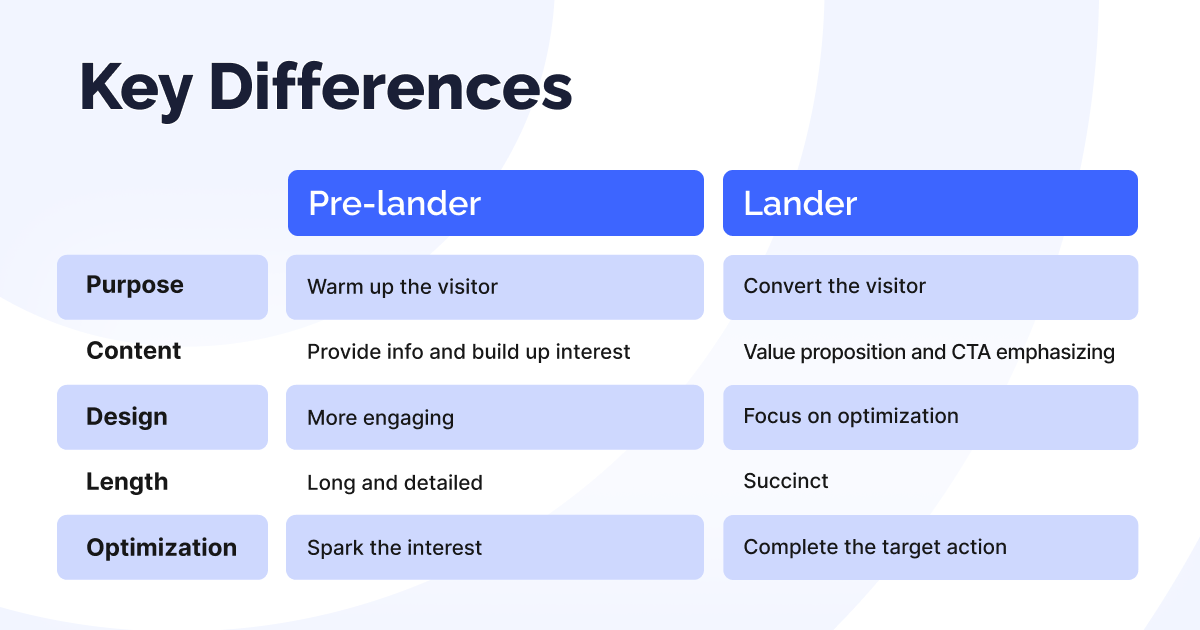
Affiliate marketing is impossible without landers. But do you know that the landers can be different? Specifically, there are landers and pre-landers: the former is an integral part of any funnel, while the latter is a tool to achieve your marketing goals.
Whether to use this tool or not is up to you. Our job is to inform you about the key differences between the landing pages and pre-landers, elaborate on each, and provide you with a framework, which should help to decide if you need an extra element to your funnel.
This is our first article, dedicated to pre-landers, but there will be at least two more. Strap in as we dive into the world of landers and pre-landers.
Landers Explained
The landing page is the final destination of any marketing campaign. A product owner gives a set of landers, and affiliate marketers seldom can change them, but there are exceptions.
Specifically, an affiliate can tell the merchant that some element of the landing page requires tweaking to improve the metrics. But there is no guarantee that anything will change — it’s up to the product owner.
Affiliate can control the design of the lander when the lead form is required. Typically, the merchant doesn’t provide any landing pages in this case, asking only for full name, phone number, email address, etc. This can be the case for the Finance vertical.
A lander can be based on various pages:
- Home
- Subscription
- Pricing plans
- “Get started”
- Trial download
- Product description
- Email opting-in
Most of the time, however, affiliates imply pre-landers when referring to landing pages.
Pre-Landers Explained
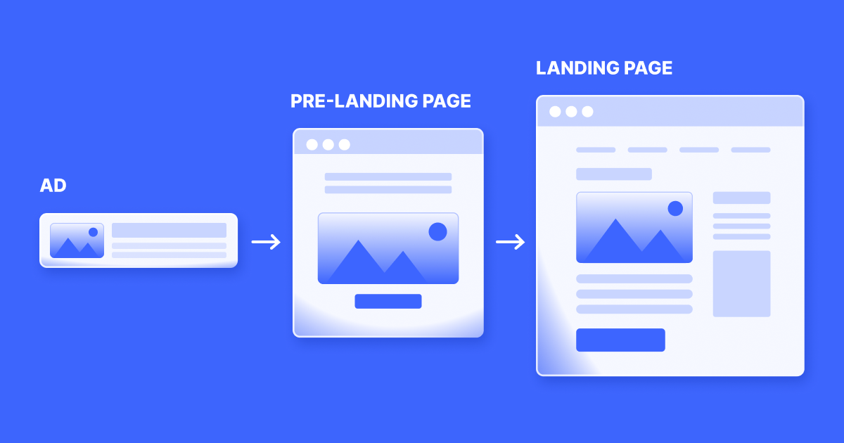
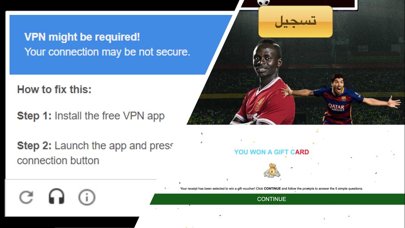
The pre-lander serves as a bridge between the ad and the lander. The affiliate decides whether to include such an intermediary, how to design it, what should trigger it, etc. Sometimes, the transition between an ad and a landing page might be too abrupt, causing the funnel to fall apart. This is especially the case for Popunders (OnClicks), where no creatives are used.
A good funnel tells a story, involving 5 elements:
- Hero, sharing a relatable backstory
- Issue, a challenge that the hero is to solve
- Guide, giving a roadmap on how to solve the issue
- Solution, the destination point of the roadmap
- Outcome, highlighting how the hero’s life has changed for the better
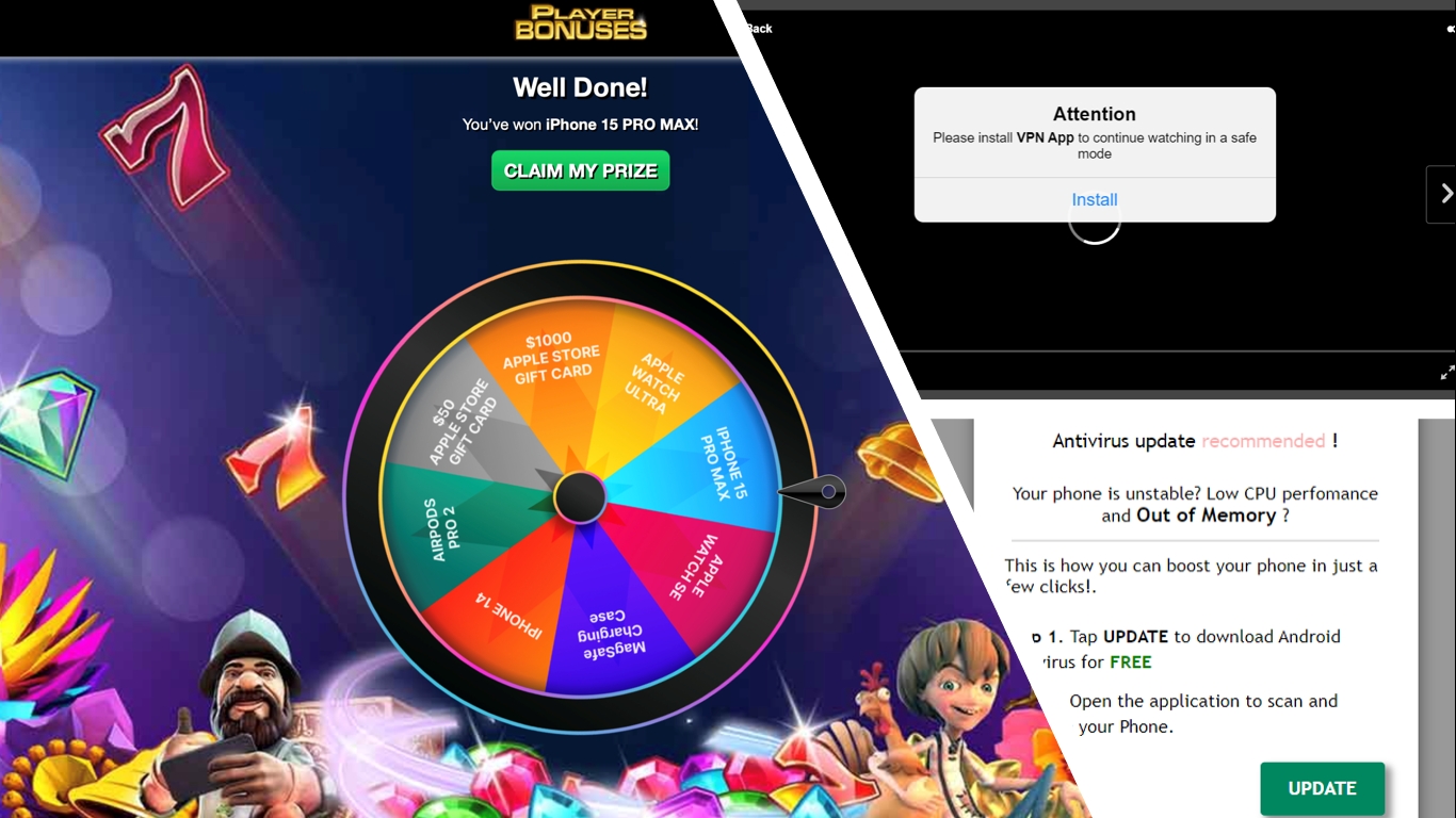
Pre-lander is a funnel and UX savior, if you need to squeeze in testimonials, product reviews, comparisons, engaging stories, etc. Its flashy CTAs and attention-grabbing headlines are designed to generate interest, build anticipation, overcome objections, and warm up the audience overall.
When to Use Pre-Landers
We’ve mentioned that pre-landers are not obligatory. So, when is the best time to use them?
- Complex products or offers. Antivirus, Utilities, and eCommerce are just some verticals, which benefit from pre-landers. For example, eComm works great with a two-step funnel, since it enables squeezing in testimonials, F.A.Q., video reviews, HQ visuals, User-Generated Content, and more info overall.
- High-ticket items. Mortgages or vehicles require substantial commitment, so the users might feel extremely cautious. In order to break the ice, you need to calm them down and garner trust using testimonials, case studies, or other social proof elements.
- Cold traffic. Not all the users come pre-engaged, which is why you need to warm them up before selling anything on the lander. That’s where pre-landers shine at their brightest.
- Lead generation. A set of questions or engaging content assists in qualifying the leads, based on their preferences and needs. Pre-landers help to filter out the users, who wouldn’t convert anyway, which is useful for meeting strict KPIs.
- Compliance ensured. Finance or Mass Torts involve strict regulation. Pre-landers might contain all the necessary terms and conditions to ensure the user is properly informed with disclaimers.
- Standing out of the competition. Despite being an extra step in the marketing funnel, pre-landers help to increase the value of the offer. For instance, they might contain unique insights, bonuses, or special offers.
- Better personalization. Pre-landers can be tailored to specific audience segments or demographics, based on the visitor’s interests, preferences, or previous interactions.
But in order to work, you need to invest time and effort into pre-landers. It’s an extra funnel step, which is to be justified. A poorly designed pre-lander can scare the user off and ruin even the best landing pages. Moreover, some product owners might be against using pre-landers. It’s all about striking the balance between being informative and succinct.
How to Design a Pre-Lander
Designing pre-landers involves a few foundational steps. Check them out below:
- Picking the message of the pre-lander. It goes beyond the marketing campaign mission, like brand awareness, subscriptions, lead generation, or sales; and includes the tone of voice: to tease, to scare off, to engage, or to inform.
- Checking out pre-landers provided. Some product owners have their pre-landers available. While making your own pre-lander is a better idea, you don’t always have enough time for that.
- Staying succinct. Keep the elements serving a specific goal. If there is no reason for something to stay in the funnel — discard it.
- Maintaining consistency. You need your pre-lander to serve as a bridge, continuing the story established in your ad and leading to the offer page. If it goes astray, your users will follow.
- Using clear Call-To-Action (CTA). Besides being informative, pre-landers must lead to an exact place. Make sure your users don’t get confused when navigating through your funnel, including the pre-landing stage.
- Relying on high-quality visuals. Besides using high-resolution stock images, consider utilizing just enough details to nudge into taking action.
- Utilizing PageSpeed Insights. This tool helps to control the KPIs of your webpages. Your users won’t wait forever for the best visuals in the world — they just don’t have time for that.
- Conducting A/B test. Initial split-testing is a must, but if you want to squeeze the most out of your pre-landers, you need to test continuously. Customer preferences shift, and A/B testing helps not just to perfect your funnels but to capture these changes.
Ways to Fix Non-Working Landers
So, if you’ve created a pre-landing page but haven’t seen a significant increase in conversion rates, there are several steps you can take to improve its effectiveness.
- Conduct an audit to ensure that your pre-lander loads quickly and is free of technical errors.
- Review the content for any errors, such as inaccuracies in currency, data, or regional slang that could impact conversion rates.
- Check any comments on your pre-landing page to ensure they sound authentic and positive. Consider sparking discussions to increase engagement.
- Utilize retargeting to continue engaging with users who have visited your pre-lander, increasing the chance of future conversions.
- Ensure that your page is targeted to your audience, visually appealing, and well-organized to avoid confusion.
Miscellaneous Tips for Maximum Impact
Some practical tips on how to make your pre-landers convert better.
- Go for the exact CTA, not just “Get Started”, e.g., “Buy It”
- Use first-person voice for CTA, e.g., “Claim My Book”
- Utilize code-free solutions for building pages and websites, e.g., Nicepage
- Incorporate antivirus or security badges:
- Display recognizable security badges to instill trust and credibility.
- Ensure you have the legal rights to use these badges to avoid any potential legal issues.
- Customize with country flags:
- Personalize the landing page experience by displaying the visitor’s country flag.
- Tailor the content and offers based on the targeted geographic audience.
- Focus on targeting one country per campaign for easier tracking and optimization.
- Create urgency:
- Utilize countdown timers to highlight limited-time offers or registration periods.
- Implement phrases such as “Limited Time Offer” or “Last Chance” to convey urgency.
- Inject urgency into ad copy to compel action from potential customers.
- Optimize engagement and user experience:
- Use vibration feedback for mobile landing pages to create tactile engagement.
- Implement intro Popups or JavaScript alerts to capture attention and convey important messages.
- Remove distractions like social media buttons to keep the focus on the primary CTA.
- Optimize landing page loading speed to ensure a fast and seamless user experience.
- Automatically redirect users to the offer page after a set time interval to encourage further exploration and action.
Conclusion
Pre-lander is an ideal tool to smoothen the edges of your funnel. You can use it to inform the user better, warm them up before the purchase, and increase your chances of conversion. But the pre-landing page is to be designed properly, it is to bridge the gap between an ad and a landing page.
Unlike the landing page, the affiliate is in full control of pre-landers. You need to understand why you’re using it and stick to that goal. Otherwise, they tend to backfire and can ruin even the best offer pages.
But with RollerAds by your side, you have nothing to worry about. Our mission is to make your profit generation simpler, more bountiful, and more pleasing. Contact us for any assistance and let’s profit big.